All of which is a feeble excuse for being 3 cards behind for Daring Cardmakers...
8th August was the first of the month so a chance for Elemental Inspiration


I used
the patchwork wall
chrome effects (the lamp shade)
flowers
teal and yellow.
I adore teal - it is the main colour in my bedroom and kitchen. Maybe I could do a wall like that? The papers are a mix of old ones and the die cuts are from a recent Quirky Kit.
The next dare was a room with a view - to make an aperture card with a scene behind it. My card for this was pretty late but there you go...

I made an aperture card with a porthole effect, putting acetate in the middle. On the inside I had a die cut circle the same size as the aperture hole and layered up blue coloured card and a small semicircle as the sun. I added dots and sparkles with glitter glues.
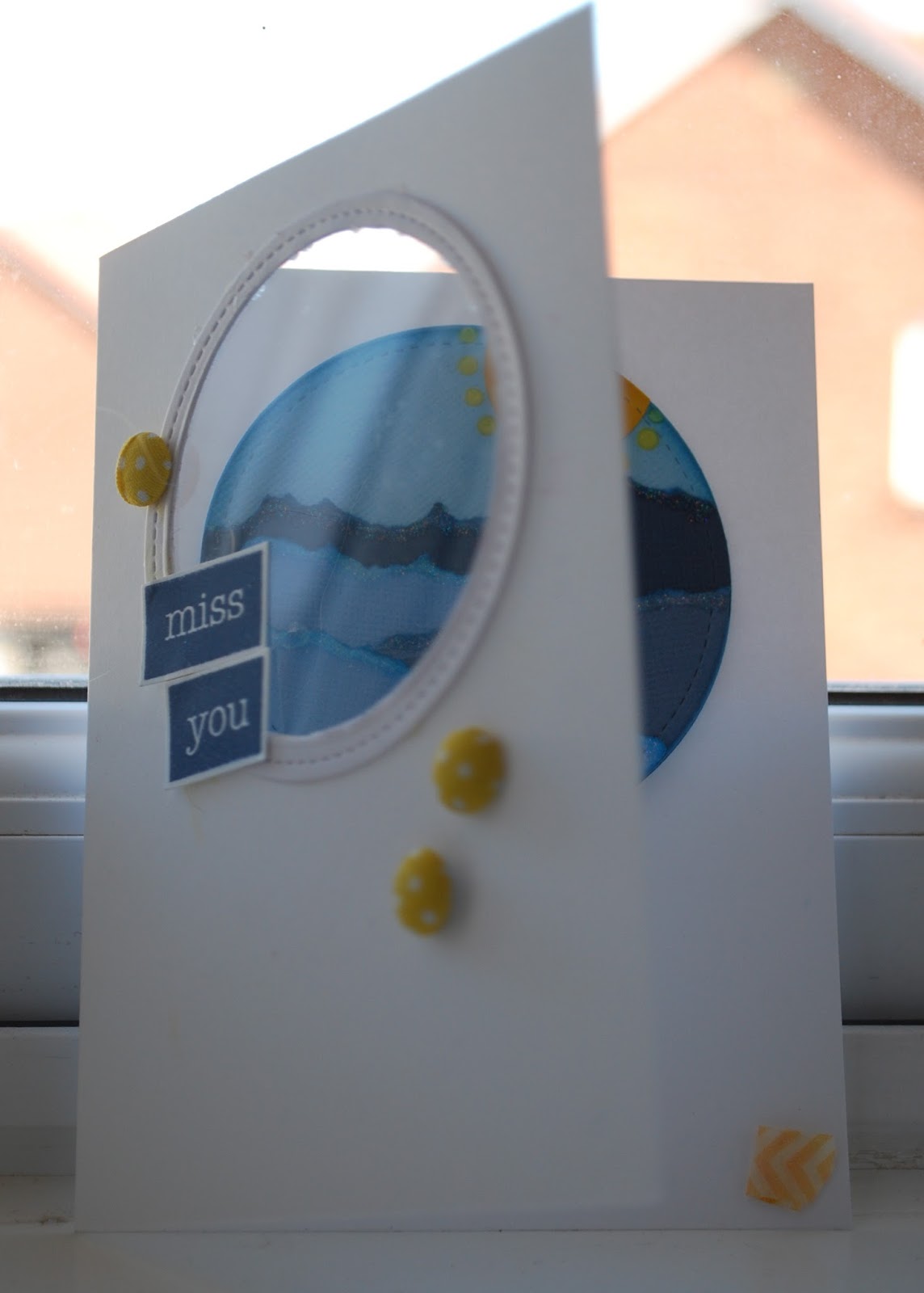
When it had dried and I picked up the card, somehow some yellow distress ink had got on to the front (it is a mystery but I am untidy and anything can happen!) So that decided the placement of the stamped letters and also meant I had to add those lovely yellow polka dots as well....
And this week - I was on time! I so enjoyed colouring these flowers raspberry and lime as per the request

I used another die cut circle and started colouring with Distress Inks but even the Raspberry one wasn't vibrant enough for me. So instead I went for the Clean Colour brush pens and they delivered. Some of the flowers and leaves were stamped and embossed directly onto the circle and others were done seperately for increased dimension. I did sneak a bit of blue in so that the whole thing wasn't too sickly.
OOh that reminds me of when I was small and my mother overdid the food colouring and created a layered cake in almost exactly these two colours - only brighter. "Who made THAT?" said a man, temporarily blinded by the cake. "I did" said mum. Not sure she ever used food colouring again
The icing could well have been similar to the background of the card. I mixed some texture paste with some Mowed Lawn distress ink and pushed it through my favourite stencil. While that was drying I stamped and embossed my sentiment, layered it all up and job done.

I've done a wee hint of scrapping as well...


I'm knee deep in Quirky Kits now and have so many photos to scrap after a crafty hiatus. Leo makes it so easy with her choice of embellishments and papers. Loving it!