Friday, May 30, 2014

Almost there

I just have one duty left before I am on my 3 month sabbatical. Yippeeeeeeeeee!!!!!
Of course I love my job....
but it is also wonderful to be able to step back for a while.
I don't know whether I will set up a new blog or use this one for reflections as well as crafty stuff. Probably the latter (lazy, moi?) as I like having everything in one place (and starting new blogs is scary).

On a solely crafty note here are some new cards to share.
This week at Daring Cardmakers, the mightily talented and lovely Zuzana has asked us to wish upon a star
I cut a piece of white cardstock to be just a shade smaller than my cardbase and attached some Spellbinder and Dienamic star dies to the back with Washi tape. That meant I could place them and die cut them all at once. I then chose some papers from Fancy Pants Nautical (except for the green star paper which is Crate Paper Party Day) and stuck them down to the cardbase. I then dry embossed the star cut piece and used a black pen to outline it - I was so not going to do this but just had to! The top piece was given the foam pad treatment to give some dimension. The sentiment is from the Imagine That Wish upon a Star set. The star gems are all from a large pack that I bought in a sale in Wilkinsons - 50p!

I met my parents at Dyrham Park, a National Trust property near Bath this week, to celebrate my mother's birthday. I managed to get lost on the (long) walk between the car park and house - a story which will be scrapped in the near future. This is her card
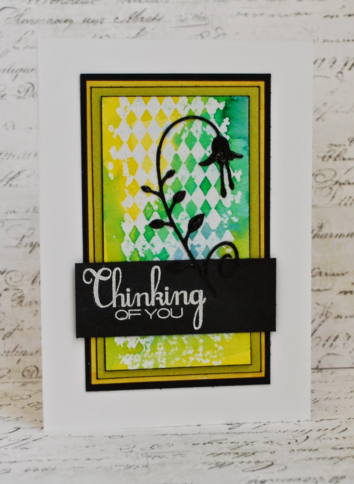
I am still trying out ideas from the watercolour class. For this card I inked up some flower and leaf stamps with Distress Ink and then washed colour over them. The idea is to go over the edges but it is hard to keep going when it feels like more of a hot mess. I was quite pleased in the end - although I did go over the flowers with a black pen and added white dots. It is quite shiny and sparkly in real life, thanks to some Wink of Stella glittery pen action
I also handed over a Father's Day card as I won't be seeing Dad before that special day and wanted to make sure he opened his present before he goes away - which is also before Father's Day.
This card nearly had me tearing my hair out as it kept going wrong! I used a lovely sunshine Simon Says Stamp die that was part of my prize from Lucy Abrams.  Most of the papers are from Fancy Pants Nautical again but also include a few Authentique Seasons Summer as well. The little chipboard piece I have had in a box of man shapes for a long time - but not as long as I have had those little Adornit letter stickers. "You" is a Papertrey Ink die.
The glitter was added to (almost) cover up a green ink mark that went from my fingers to the completed piece. Dad wouldn't have liked the words I was saying at that point. The enamel dots are a similar cover up. Sigh. If only I could be clean and tidy.

The day after mum's birthday is our wedding anniversary - 26 years. Here is the card I made for Phil
The French wooden die cut was bought several years ago from a Scrapbook shop in a village somewhere near Calais. The other papers, stickers and washi tape are all from various Crate Paper sets.
I bought him a bird made of recycled metal from the National Trust shop. When he remembered it was our anniversary...... (!) ("I thought it was tomorrow") he presented me with a lovely gift. And even took it out of the box for me so I didn't have to touch the scary polystyrene
Just remove some of the hair from the bloke, make her hair shorter, darker, add glasses and a slightly more dumpy frame and it is just like us! I love Willow Tree and this is a fab addition to the ones we have.


Friday, May 23, 2014

I may be small but I'm not delicate


as I reminded myself this week.
The amazing Leo gave us quite a challenge on Daring Cardmakers this week - to make cards featuring Origami.
Now origami was originally done by small and delicate Japanese people using small and delicate paper.
I am small - but definately not delicate. Imagine Miranda having been washed on a too high setting - that is me.
I did give it my best shot. I started noting the instructions for a flower but after fold 25 I gave myself a talking too and Googled "origami for children and cack handed adults". Actually it only said "for children" but Google knew what I meant really.

I found a simple fish and then looked for papers. Deep in my file of papers I kept because I loved them so much and now don't really love them at all, I found some "Love, Elsie" and actually - these are still quite cool. I went off them a bit because the paper is thin - which was perfect for folding.
 And even with thin paper and easy origami it didn't all go swimmingly....

So ignore the less than crisp edges and the inky finger splodge and the fact that it really says "Best birthday Fishes" and then I decided that birthday was too much but had already stuck it down and knew that if I attempted to remove it the paper would go with it. But it is cheery!
(Oh and I possibly dry embossed the wrong side of the cardstock but lets pretend I meant it like that)

Here are some more cards I have made recently and not got round to blogging.
This one uses the Avery Elle Laurel stamps and dies. I have loved everyone else's cards using these and then struggled myself until I did this card which is mostly a copy from the Avery Elle blog.

I think the secret for me was using Memento Luxe ink pads which are nice and vivid
this card also features a Crate Paper embossing folder and some Cosmo Cricket paper. White gel pen dots help as well.

I have also been playing with more inset dies. I made 6 similar cards as I had that many rainbow pieces cut out:) (Dies are Paper Smooches)

and finally for now
Pink Paislee stamps and paper, Clearly Besotted and Lawn Fawn (I think) dies.

I have some layouts to share (this is the trouble with mssing blogging for so long) but will be back soon. Tomorrow I am going to be singing with a choir at Evensong at Exeter Cathedral - I am joining for the first time and am nervously excited. If you are in Exeter at 4pm then come for a listen. Sunday is my last preaching engagement (well apart from a wedding) until the beginning of September as my three month Sabbatical begins on 1st June. 

PS Blogger appears to be playing up and I can no longer see the pictures. I hope you can - if not I shall restore them asap


Thursday, May 22, 2014

Water load of fun

I have recently enjoyed the Online Card Class Watercolour for Card Makers. It came at a time when I couldn't do much crafting due to lots of work plus 7 stitches in my crafting arm. However I did manage to produce some cards and I love all the things that I have learned - and have loads left to try as well.

Firstly some watercolour backgrounds
 (Dienamics die and Clearly Besotted stamp)
 (Studio Calico chevron stencil, Clearly Besotted stamp, some seqins and a pearl mist which you can't really see on the photo)
 (More Clearly Besotted stamps and MME enamel dots)
(Dienamics die, Clearly Besotted and Kaisercraft stamps)

(unknown stamp set; Maggie Holmes Crate Paper; Martha Stewart punches; Clearly Besotted Die and stamp)

then some watercolouring stamped images - my card is a total copy of the one in the class (not as good obvs) as I have the same stamp set - yes - by Clearly Besotted! (sentiment is by Avery Elle)
and one using an embossed background. I coloured it with Inktense pencils. Sentiment is Avery Elle
and finally faux hand painting using Gelatos. I adore how this came out (this was a first stamping that was actually better than the second in my opinion) Flower stamp is from Waltzing Mouse, sentiment is Simon Says Stamp. The background is versamark/white embossing powder through a Tim Holtz stencil
I have some more part made cards to finish and want to try other techniques that I have learnt as well. You can still do the class even though it has finished live and I highly recommend it

Friday, May 16, 2014

Oooh missed it

Well I've missed lots of things really

I've been missing from the blog for 5 weeks or so. Loads of reasons, mostly tedious and once you stop it is hard to start again
Which means I missed my blogaversary - I haven't got a date on my first post but it is something like the 8th May 2006. So 8 years I've been slightly squiffy now. I will put together a little giveaway soon (I'll admit it is mostly things I have accidentally bought twice. Its my age). Perhaps when I am on Sabbatical. I am going to be missing from my job for 3 months. As a Minister we get paid leave every 10 years (mine is every 11 at the moment though!) and I will be gadding about in the summer as Pilgrimage is part of my theme. But I am also going to put some craftyness in as well and may well use this blog as a record for that - or set up another with a link. Probably the former as the latter sounds complicated.

I'm missing a bit of skin as well. Two smallish moles were taken away and then it was decided they needed to take more skin. I'm longing for the stitches to come out as I am feeling like Frankenstein's monster at the moment.

I will try and catch up with myself but for today will just recap on those Daring Cards I did and haven't blogged. I'll go backwards though  - from feathers to football to flags
Feathers is this week's theme from super Sharon.
I made what was going to be a quick card last night which turned out to be not so fast
I knew that I would use my lovely Clearly Besotted feathers. I have some extra thick vellum from Craft Creations which takes embossing like a dream so I inked the feathers using various dye inks and added clear embossing powder. I cut round the feathers and they were all transluscent and lovely.
Then I decided to do a background as I am currently enjoying the Online Card Classes Watercolour class. I started by adding some white stencil paste to a dotted stencil.
And then I was impatient and didn't wait long enough for it to dry. So when I put ink on top the dots turned to splodges
So I started adding things to try and cover up the mess
And spilt a Tattered Angels Mist over it (the lid was off so I could flick some dots)
I decided some gold would help (I almost added yellow instead but THAT was actually averted). Then thought there ought to be gold on the vellum.
Which of course then crinkled up - as it has done every time I have tried this....
So I die cut the feathers from white cardstock using the matching dies and stuck the vellum down.

I reckoned that although the whole panel looked one hot mess I could maybe just use a sliver of it - which is what I did. The sentiment was stamped over the top (from the same CB stamp set).
I placed the enamel dot down, decided I didn't like it there - but it took the paper up with it so it went back down again...
and we wont mention the fact that I didn't notice the odd shape of the gold sequin.
Considering the catalogue of disasters it isn't as bad as it could have been...

Last weeks dare was from the amazing Jo - she wanted us to be inspired by football.
It was good timing for me as I need to make a card for Phil's 50th birthday - which is today. He is a big Bolton Wanderers fan and had mentioned that the elephant logo is coming back to the kit - much better than the rather boring dark blue and white of the strip. You can see the logo here.
I used little Memory Box dies to make the castle. The elephant is a PTI stamp. I have these fab Lawn Fawn Milo alpha stamps where you can stamp the whole word at once. Bolton's motto is "Supera Moras" - overcome delays but I canged it to "Supera Saeculum" - overcome old age. Some black glitter letters approximated the Bolton Wanderers main logo.
He had spotted me printing up a photo of the elephant so it wasn't a huge surprise today but I think he liked it!

and finally to catch up (I was missing from DCM for 3 weeks as well!) - flags 
This one was my choice as I thought flags could be inspirational in all sorts of ways. I went for the look of Japan
I made a stencil that I could stamp and emboss a large backround stamp through using white embossing powder. I then added various red Distress Inks and buffed it up. Some strips of Kaisercraft paper, my favourite birthday sentiment (Paper Smooches) and some black Stickles and it was done
Ooh nearly forgot a little strip of washi tape just for interest!

That'll do for today. Hope to be back again sooner than I was this time :)

Tuesday, April 08, 2014

Embedded die cuts

I really love the new trend for using die cuts so they sink within your base panel. It is quite fiddly but well worth it in my opinion.
Here are two examples made with some really cute and bargainatious dies from Clearly Besotted
This card was inspired by unearthing some teeny tiny brads. I chose three colours and found cardstock and papers to match. When I started card making I used to subscribe to the much missed Self Addressed card kits. I had loads of left over coloured cardstock card bases and I have now started hacking into them in order to create mats like this as I do prefer white or cream bases. I cut each word seperately and made sure I captured all the tiny white bits to put back when the coloured word went into the white cardstock (OK I cannot tell a lie, I might have had to recut parts of the words in order to make sure I had all the pieces). The star is a QK die cut from Amy Tan paper, raised on foam pads and given a few dots of sparkle

This one uses more October Afternoon papers (I am trying to use up some of my old collections) The leaf die is from Clearly Besotted too. The flowers are punched using a Stamping Up punch. I added some stick on gems and covered the words in Glossy Accents.

And finally a card that uses die cuts in a more traditional way
using more Clearly Besotted stamps and dies

Sunday, April 06, 2014

Trying (and failing) to be like Jennifer

I have been going through a season of spendies in terms of card making recently. I am thinking about challenging myself to not buying any more for now - at least after the parcel I am waiting for arrives.... There is something disquieting when I get the "gimmies". Manufacturers bring out new products every month it seems and so many people make lovely things with them and I yen to do the same. Sadly, I don't always manage to make cards as fab as theirs and so move on to the next new thing instead. There is something important about learning to be content and enjoy what I have. But that is a scary thought so we will see....

Anyhoo, here are a few of my new best friends - all that were inspired by some amazing cards by that fab teacher - Jennifer McGuire
This was me trying to channel Jennifer McGuire (and using the same stamp set as well) This was my first go which I had to do fairly quickly so Phil could take it to his mum's. The stamps are MFT's Easter Bunny. The sentiment stamps are Clearly Besotted. I didn't quite get the spacing right so added some embossed lines. There was a lot of sparkle added by using a Wink of Stella pen and some liquid pearls. I loved her card so much that I bought both the flower set and the sentiment set that she used as well. I thought it would be good for some of the kind of cards I need to send in my line of work 
The phrase comes from the MFT set Words of Inspiration. I die cut this Dienamics flower from several papers (the green and orange are from Webster's Papers) and then embedded them back into the piece cut from white cardstock. A few gems and some foam pads and the card needed no more (in my humble opinion)

This card features another die cut freebie from Dies to Die for. I coloured it using some Copic glitter pens I have long neglected. The MTF sentiment is stamped with a grey ink

The final card for today was also inspired by Jennifer. I was in two minds about posting it as I think it is one hot mess to be honest! Jennifer made these awesome cards using watercolour paints and a thin paintbrush. She also used a stamp as a guide. I thought I would try freehand
A fail in my opinion
Maybe it is because my writing is still too thick (although I tried to use the thinnest brush I have) but to me it looks rather childish and silly. The main panel is watercolour paper and all the other elements of the card are from October Afternoon.
So what do you think? Should I persevere or give it up as a bad job?
And are you going to dare me to stop buying for a while?

Friday, April 04, 2014

Shiny happy people

Call me shallow (hello shallow!) but I do like a bit of shiny glittery paper. Whilst making an order for card bases at Craft Creations, on impulse I added a few sheets of glitter card to my basket. Glitter card used to be a right pain - flaky or slightly off in colour. This is adorable. As you can see from my last two daring cards which both feature said glittery gorgeousness.

We'll go backwards from this week - it was my turn to choose a colour combo for the month. I was drawn to this one from Design Seeds
It was only later that I began to wonder whether the fact that it is the colours of the Welsh flag might have influenced me! But I do love a bit of green and red and I think the cool greys stop it being too Christmassy. Although it would still work if you are one of those people who like making Christmas cards all year round.
I don't....
I went through some of my many paper pads and picked out some toning papers - from Kaisercraft; American Crafts Amy Tan and Simple Stories. I used a Dienamics flower die and cut the leaves and flowers out several times. I assembled the pieces behind a vase made using that glitter cardstock and a punch. (One that I have had several years and NEVER used!). The "thanks" is a die cut that came from Dies to Die For. I do like the way that they send some samples with an order! I added some Glamour Dust to the die cut and also to the die cut letters that I cut from green paper. Some of the flowers were raised on foam pads and all had little diamente gems stuck in the middle. And that is that.

Last week I did make a card in good time for the fabulous Svenja's dare. But my hubby had taken the camera to his mums and I couldn't take a photo (somewhere in the house is at least one more working camera but we can't think where!)
He did take some wonderful shots though

so I forgive him!
Plus he did help me out with Svenja's dare - Money makes the world go round
I was a bit stumped until he suggested looking at pictures of money. I looked at a Euro coin and went "ker-ching!"
I combined silver and gold glitter card. There is some dry embossing on the right hand side as per the coin but that is really hard to see. I also gave an authentic tone on tone look with a Heidi Swapp glittery sticker. But to avoid that completely blending in as well I added a die cut heart. Some very old LYB letter stickers and a very new Clearly Besotted word die and some almost as new Fancy Pants papers finished off the card - along with some stick on gems.

Right (imagine me brushing my hands together as if there is work to be done). I am now going to write some more quick blog posts as I am forever making things but not having the time and energy to share them here and what is the point of a blog if you don't. There may be some things a-changing soon but I will leave all that to another day....

Friday, March 21, 2014

Minding the gap

I was just feeling pleased with myself that I was blogging fairly regularly when life got in the way again. I have had very little play time recently which is never good. And when I sit at the computer there is often work to do (or just enough time to play Pearls Peril and/or Criminal Case on Facebook) before going out to do more work. Or I am tired after the sentence above.
There we are then.
Soooooo, catch up time.
I did make a card for last week's Daring Cardmaker challenge - Fairy Tales. It was a clever idea that had us all thinking hard and I think the team came up with some fab ideas. Mine is quite simple
can you guess the tale?
give up?
Its Goldilocks and the Three Bears!
The papers are all Websters Pages and I added gold glamour dust and a Clearly Besotted stamped sentiment in Delicata gold ink (which is LOVELY). I do feel a bit sorry for big and small butterfly so I might actually give them more gold before I send the card anywhere!

This week we were sent some lovely goodies by Docrafts - some dies and papers. Many of the team were sent Gorjuss images but I had just the papers (but two die sets so I am not complaining!) which is why I don't feature any cute girls on my card. Hopefully it still counts as Die-licious!
I was sent the fabulous butterfly - there are several different wings and a side view as well. It is fairly big - this is a 4x4" card. There are holes in the wings and I decided to fill them up with gold cardstock from Craft Creations. I used the rest of the cut out gold card as a second layer to lift the butterfly without adding too much bulk.  The dots on the body of the butterfly were made using Beads In a Bottle in gold.

The doily came from a Quirky Kit and was originally kraft but I sprayed it with Gold Lame colour shine. I added some cream cardstock which was embossed with a Maggie Holmes folder. I bruched the cardstock with Delicata gold ink. "Love" was diecut with another Docrafts set - a lovely swirly alphabet. I cut this twice - once with the purple paper and once with the gold and offset it ever so slightly for a subtle effect. "With" was spelled with some Carolees Creations alpha stickers I have had forever.

Here are some close up shots

Ah yes, I did add some Stickles blobs which went horribly wrong and dried to be totally the wrong colour so I slapped some toning pearls over the top! I wish I had done the panel in vellum not cardstock but there we are

Here is hoping there is less of a gap before I can next share my crafting.

Friday, March 07, 2014

Feeling slightly colour blind

This week at Daring Cardmakers it is time for the monthly colour challenge
It is absolutely gorgeous
Now when I have some crafting time I copy and paste various sketches and ideas onto an A4 document. I try and get as many as possible onto one page (cheap I am) and possibly I made my copy of this colour seed just a leeeeeeetle bit too small as I "read" the colours wrong. I was v. cross with myself as I absolutely love these colours together, but just didn't have any time to make another card this week.
I haven't told my sons yet but I know they will enjoy this mistake as they are both quite prfoundly colour blind and being a loving mother I have spent many happy hours laughing at them getting colours wrong.
Anyway, here is my card
Papers are from the latests Amy Tan 6x6 pad, a Kaisercraft Christmas pad and some very old Heidi Swapp.
The dies are from Dienamics; Sizzix and Clearly Besotted and the sentiment is from Imagine That. Oh and I used two circle punches and some Hobby House gems.
The finished card is quite nice but I will never love it as I will always say to myself "why did you see that colour as yellow and not lovely sage green. why? Why? Why!"

I did play with other colours for a new challenge this week. I saw some people playing along and decided to have a go.
Virginia wanted people to use watercolouring as well as this inspiration piece
and I made two cards
This one uses a free stamp I had with a magazine, embossed in white and then watercoloured using yellow, pink, orange and red distress inks and a waterbrush. The papers are Heidi Swapp, Amy Tan and MME. The sentiment is computer generated

This was another free stamp, watercoloured in a similar way. I added Amy Tan papers and some washi tape. The balloons are Clearly Besotted dies and I had drew the string. The balloons were given the Wink of Stella treatment
Expect to see loads more cards like this as I really enjoyed the process :)


Friday, February 28, 2014

Always look on the bright side of life

Even when it is hard!
Phil and I are struggling with the Cold That Will Not Go Away.
He is almost at the end of week 3 poor lamb and I am well (or not well) into week 2. We are mostly able to work but then get all weak and feeble all of a sudden and have to rest a bit (or watch 24 or Fringe, depending on who gets to the tv first)

I do try to look on the bright side. Maybe actually what I try to do is look with hope. That is a fundemental part of what Christian faith means to me - that I have hope that God can make a difference in my life and others; that I have hope that I can share his love and that God works in all things to do good. Of course, I struggle with this at times - when people don't behave as they should; when tragedies happen; when life is plain unfair. But I still have hope. In funerals I sometimes use the prayer "you can change the shadow of death into the brightness of a new morning" and to me that is what hope is about.

Which is what I wanted to express in my cheery card using the song lyrics/sentiment from the Life of Brian. It also reminds me of Phil singing this at a karaoke evening on a French campsite and the organisers apologising profusely to parents as it contained a (mild) four letter word. It would be a Minister who used profanity ("I only read what was on the screen" says Phil)

And why make such a card? well Gez asked us to be Sentimental for this weeks Daring Cardmaker challenge - and use a phrase that means something to you.

I used papers from the new Amy Tangerine pad (the yellow); the new Maggie Holmes pad (theclouds)  and Simple Stories colourwise (the black and white chevron). I added one of those fab October Afternoon chipboard clouds, a typed sentiment (font: Times and Times Again) and some Smash washi tape.
When I made the card last night I added some Liquid Pearl dots to the washi tape and left them to dry. It turns out that washi tape is not a good surface for the dots as they all fell off this morning!
(the background is some scrap paper I have used to do my Sharpie pen outlining. And stapler practice. Yes, I need stapler practice)
So the dots were replaced with stick on pearls....

Did I mention how much I love those clouds?
Have a good weekend - I hope that you are able to look on the bright side - and know some hope in your heart too :)


Monday, February 24, 2014

A walk down memory lane

Last week was a trip down memory lane. Only from last year though as we stayed in the same cottage for half term as we did then. Phil and I have had rotten colds which are hard to shake off so we spent a quiet time relaxing, eating and walking a bit. The main excuse for being there was catching up with Emrys. It is so nice to hear him and Carys chattering and giggling together.

And I have had a longer trip down memory lane with this week's Daring Cardmaker challenge. Sharon chose the theme of Old but not forgotten, trying to find our oldest crafting buys to use. I don't have much of my very oldest. Many of those papers and stamps I have given away in the past. But I have kept a few, which I have used this week.

The first card uses some lovely Basic Grey Urban Couture thatI have been hoarding
the red panel is actually from a folding matchbook album that I have never used. I added some chipboard from my stockpile (don't use much of it, can't bear to part with it) which I coloured using MR Huey white and a Glimmer Mist chalkboard green paint to try and approximate the colour of the backing paper. It is slightly more successful in real life than it photographed. The sentiment is one of my first ever stamps - a wooden backed one. I've never found them that easy to use. I added flowers from an Imagine That set and some sticky gems. The final touch was a Martha Stewart butterfly. Oh and everything is inked round the edge using Vintage Photo distress ink. The only colour I had for many years!

To be honest, I didn't really like that card much so decided to have another go. I was supposed to use another old stamp but forgot and used a newer one. I'm glad really as the old one does look terribly out of fashion now!  I used a Freshly Made sketch
to make this
More old Basic Grey - this is my first BG love "Lollipop Shoppe".
I used a very old Sizzix die for the parcel.
The sentiment is Clearly Besotted.
And to be totally retro - I used one of the last peel offs I still own!
The parcel is mounted on foam pads


I've also been making layouts. Here is one that also uses up some old kit
The photo was taken last week when it was still really awful down in the South West so there is a blue cast to the white that I can't eradicate with my photo shopping skills (none)
There is no patterned paper on here at all. I emptied out two packets of die cut pieces from the Girls Paperie that I have had for years - lots of frames and pennants and clocks and things that I have used endlessly and still never seem to finish. So I placed them down on the page and then gessoed over them so that close up you can still see the pattern but they don't overwhelm.
Then I decided to outline them all to give some extra dimension.
There were lots of little numbers and I added the letters that began each of our names. That was a blessing in that there wasn't a full alphabet in either packet of die cuts - just that our initials featured in the selected words (Lucky and Travel as I recall). As you can see there weren't quite enough numbers so I had to improvise
I thought these Cosmo Cricket alphabet stickers blended in very well
Using up all that old stash was enormously satisfying!