Thursday, September 26, 2013

Overloaded

Life is really FULL at the moment. That isn't necessarily a bad thing - although there are a few bumps in the road that I would like to be able to squish with a size 10 boot. Sadly my boots are only size 4 and anyway that is just not my style so...
It all does really remind me how blessed I am to have a husband who does AT LEAST  50% of the housework/catering at home. He really is a star you know.

My Daring Card was so late to the table that I am going to add it into tomorrow's post. Well it might be tomorrow. It might be Monday when I post again - that is just how it is. But September is nearly over and October might be slightly easier and then we are in the home straight for the thing at the end of the year that if I don't start to plan for in early October I will be sunk.

So instead of a card - here is a layout based on the latest Inspired Blueprints sketch

As you will see I remained pretty fainthful to it
All the papers are from Basic Grey Junebug. Even this painted looked background that seems so 2013. I first used these papers when Hywel got his GSCE results - so 5 years ago!
I didn't want to add another paper layer so sketched in an outline using a dark blue and a light blue mist. I also added in a Kaisercraft stamp in various places, stamping with a light brown distress ink and not using a block to mount the stamp to give a more random feel.

Everything is Junebug apart from the badge (also Basic Grey)
an October Afternoon sticker
and the heart chipboard (Studio Calico). I outlined all the papers using a Prima chalk ink pad in blue. The finishing touch was to add lots of dots using yellow, red and blue liquid pearls.

Monday, September 16, 2013

A bit sketchy

I lvoe using sketches to kick start my scrapbooking - but because I am not very organised I don't usually manage to do them in the week that they are launched. Well this is my week because not only have I completed a layout for a current sketch, but the blog that I took it from gives you a whole month to submit it - which means I can also link the layout I did for last weeks sketch as well.
Result!

OK little things please little minds I know...
But thank you Stuck?! for the extra time

Firstly the sketch and layout for September 15th
and my take on it
Mine is a tad busier than you might expect given that clean looking sketch.
It was going to be simpler but the layers and patterns just kept coming! And besides the photos are all bright and busy so why not reflect that?
The base paper is from Simple Stories and the blue corrugated is from Fancy Pants but everything else is Basic Grey clippings. I was so pleased with how the big white dots worked with an eyedropper and Mr Huey white.

I loved the triangle paper but couldn't add that in so decided to turn some of the triangles into mock pinwheels.

 I didn't have enough of the ranson style letters left to do the title all in the same font but I rather like the overhanging "market"
 I used up some of my many stickers on this layout. I don't normally buy so many extras in a collection - don't remember why I did with this one to be honest! And I also used my big scallop scissors to cut the, well, big scallops.
 A sprinkling of diamente gems and I was done.
I am so glad I scrapped this. Just to remind Phil and I of the Sisyphian effort of the market workers who sweated for hours to clear the space (we know 'cos we had a meal our first night on the edge of the market place and watched them, marvelling at the hard work). They finished about 10pm only to put it back again next morning.
By the way - do you like the word Sisyphian? its about the only thing I remember from studying Camus for French A level.

And here is the layout using the September 1st Stuck?! Sketch
 Oh my, I actually love how this turned out
(And I don't say that a lot about my stuff)
Maybe because it is another memory that I so want to keep and the colours just reflect the whole holiday so well.
More corrugated cardstock! Fancy Pants is my current favourite paper company and I may have bought 3 of the recent paper packs which have two corrugated cardstocks in each.
The background circle was done using a very old Crafters Workshop circle template - look I was using it in 2008! I used lemonade Distress Ink for the circle. All of the papers and stickers are from the Wonderful Day paper pack (that I have been using a lot but still have loads left!)

The letter stickers were a bit flat so I added some Glossy Accents and Peeled Paint distress glitter
The other non FP items were these cute coated woodshapes from Studio Calico; American Crafts gold glitter tape and some teeny gold sequins


 The big white stars were cut using a Spellbinders die.

There was a possibility of Stuck?! ceasing to produce sketches but I for one am so glad it is going to continue.

it is still Friday isn't it?

No?
What happened to all the time in between?
Oh that is right - prayers/meeting planning/messy church prep/messy church/recovering from messy church/work on service almost all day/wedding/bit more prep/Sunday service/recovering from Saturday and Sunday
And now it is Monday again and I haven't blogged - and it is my turn to host on Daring Cardmakers this week. Oh the shame.

There is a thing that happens when it is your turn to choose a challenge. first you have to think one up - which is harder than you would think. Then you get a bright idea and put it out there before you can change your mind. And then, and only then, do you realise just how tough that might be. And feel that any card you produce is rubbish. Happens to most of us, most weeks! I came up with what sounded like an engaging idea - until I had to engage with it! Although I do think that the rest of the team did an awesome job!
I asked everyone to try and define their Signature Style on a card
Here is my attempt
So what do I like to have on a card? Usually a plain white background which usually peeks out just a little bit. It used to have to be a square card - much less so now but I pulled one out for old times sake! A load of different patterned papers - yup - from the new Fancy Pants Wonderful Day (again - I love these papers); Die cuts - there are 7 on this card! Stamped sentiment - usually from Clearly Besotted these days; an embossing folder - and most often this Swiss Dots one; some sort of circular embellishment - the middle of the butterfly was 3 dots of enamel accents but they merged together and so I had to do something different. So i also added some Enamel Dots - which I had already turned black using my most trusty crafting friend - the Black Sharpie Pen
I'm really bothered by the fact that the yellow on the chevron paper and on the butterfly are in the same place when they needn't be - but that is too late to change now!

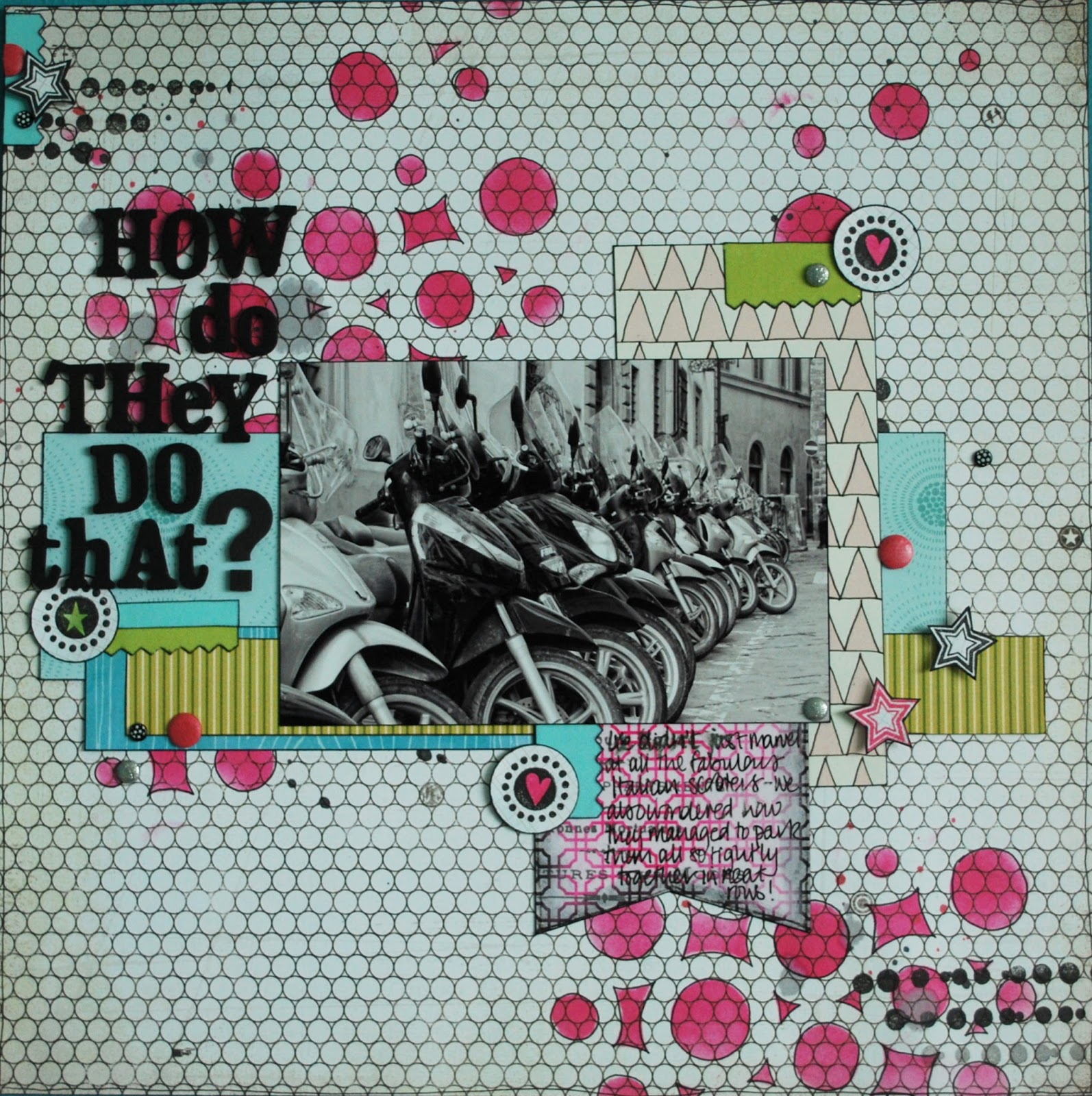
I have been doing some scrapping in my spare time (rather than cleaning or ironing) and need to actually get round to sharing them on here.

This layout used up loads of scraps of paper and I also did a whole heap of stamping. The pink shapes are from a stencil - having used pink Distress ink I then went round them all in pen. The stars and circles are all tiny stamps (I tend not to use such small ones usually). And I used loads of brads. Funnily enough I made this about a month ago - and this morning finished a layout that included loads of brads and also the Pink Paislee embossed cardstock that I used as a tag (although this time I was sensible enough not to try and write on it). Wierd how those things must have some connection in my mind!

The background paper is a Basic Grey basics. I ought to use them more often as they are fab!
Here is a close up of the smudgy journalling that basically wonders how bikes get parked like that all over Florence


Friday, September 06, 2013

Say it ain't so

September already!
I can't get over the fact that we are heading back to school/university/etc

September is one of the busiest months in the Church diary - probably because it is thought that everyone is away in August. To be honest, maybe more people are away in September which makes meetings interesting...

It being the first Friday of the month it is time for another colour challenge for Daring Cardmakers. The gorgeous palette this time was chosen by Beckie
It is lovely - but not that easy for me in that I don't have a lot of purple. But I found enough for this card
The papers are all American Crafts - some are Dear Lizzy and some Maggie Holmes (if you are interested!). The jar is a Dear Lizzy die cut. The little folded papers are actually from the tear off top part of the 6 x 6 pads - so are the clouds at the top of the pink ombre piece. I found some old purple sequin stars and a little flower which I filled with blue liquid pearls. Finally I die cut a label and added a sentiment with blue ink.

I've been having a lot of fun with the latest Quirky Kits - you can read the details on the Quirky Kits blog but here are a few of the layouts. These are three that all feature Hywel

And that will do for now!


Friday, August 30, 2013

Celebrations!

Yesterday my biggest boy was
 His dad and I had lots of fun on Facebook with old photos like this one
although now he looks more like this
and as we were walking along to the cinema yesterday I realised that he has actually grown a bit recently as I was having to look further up than I used to. (Still not tall but almost!)

We celebrated by going to the cinema to see Elysium (which I loved, the rest of the family not so much. It was quite a moral tale - but with lots of scenes to make you go "ew" as well, so sadly, although it makes you think, will not be one I can play clips of on a Sunday morning in Church) and with a Pizza Express meal (yum! and the discount code for 25% off all main courses made it taste even better). The last bit of celebration is tomorrow when we go to the zoo. We were going to go yesterday but Hywel had to sign on in the middle of the day and then we were going to go on Monday but we can't because he will be working. He got a job on his birthday in computer games programming - working from home (8 hours a day!) We are so excited and pleased and proud.

My card was made with celebrating a birthday AND a Daring challenge in mind (always try to do both if I can!) This week's challenge, chosen by Svenja, was Heavy Metal
Here is a bigger version of my card
I made a similar shaker frame for an upcoming Quirky Kits layout and decided it would be fun to do one for the card. I found some chipboard frames and painted them teal. I sandwiched acetate and sequins in between. Fiddly but fun! In order to see them better I put white card at the back. The patterned paper is Fancy Pants.

I used some thin embossing metal with PTI dies and a Cuttlebut embossing folder. I added some silver dots with stickles and left them to dry. In the morning they had all fused together - disaster! But I found some silver stick on gems and a silver (plastic) key to try and disguise the mess. I think it just about worked.

I suppose now I ought to make a congrats card!

Friday, August 23, 2013

Things can only get better

Reasons to be cheerful:
  • The sun is still shining (mostly) this summer and Torbay looks beautiful
  • Although H didn't get the job that he applied for last week he was very philosophical about it and has several other irons in the fire
  • I have recieved the latest Quirky Kit to play with and it is awesome.
  • I get to see some of my favourite people this week. They keep me balanced (well as balanced as I am ever going to get)
  • tonight is Buff-fest. Sadly we are on series 7 and every episode is bittersweet as we get nearer the end. But I've never watched this series and apart from someone accidentally giving away a major plot point I have no idea what happens. (Not quite as bad as the poor woman who had made friends with someone else on the Ferry to france who she had spotted reading a Harry Potter book, thought it was the one after and gave away a mahoosive spoiler. When she realised what she had done she spent the last 30 minutes of the ferry crossing apologising....)
  • After the last card debacle I am pleased to say that this one came together in no time

Kathy chose our Daring Cardmaker theme this week - Just Beachy  and as I live VERY close to the beach (10 mins including the steep hill/Cliff Railway) I had to join in. There was only one key focus for me - something that made the beach awesome for my lovely great-nephew Max
 (Yes ok, so our beach has this rather disappointing red claggy sand. But it is still a beach with sand, right?) 

A bucket and spade! These were cut on my Cameo using bought shapes that I have had for a while and never used. I inked the edges to give shadow and also went round with a black Sharpie for extra definition. The yellow paper is from a Fancy Pants 6x6 pad (park bench); the red and yellow spot is American Crafts Lucky Charm and the zigzag is from  Fancy Pants Wonderful Day. The sentiment is Paper Smooches (one of my most used as I am sure you are aware) stamped onto a Dienamics die cut. The last touch is some enamel dots. I had a few of these dots in colours that make me go "meh" so I covered them with black Sharpie and they are much more useable for me.

The bucket and spade are on foam pads as you can see better here
As I live in said beach resort it is better to stay at home than try to travel anywhere so that is what I am doing this weekend. If you are travelling have a fun and safe Bank Holiday weekend. And if you are in Brixham this Sunday why not come to Brixham United Reformed Church at 10:30 am (its just up from the cross roads where the traffic lights are). I'll be the short one at the front.

Tuesday, August 20, 2013

How long does it take to make a card?

In this case four days.
FOUR
DAYS
and there is hardly anything left from the first version that went on to the second version.
And even that nearly went into the bin
Sigh.
I think it was performance anxiety as I loved the Dare from Friday so much and wanted to make a most excellent card
and it all went pear shaped.
So, this weeks Daring Card challenge is "colours of the sea"
My fave colours
I love the colours of the sea and not just when it looks as amazing as this sherbert style
(photo taken of our local beach following a rock fall in May)
Green and teal and turquoise and light blue.
Yummy.
My card - not so.
Part of the problem was that some new Distress Glitters arrived that I was desperate to play with. I had the idea of die cutting a Dienamics flower, dry embossing the part left behind, smooching it with the matching distress inks and then replacing the flower - now covered with the glitter.
BUT I had forgotten that on the video I had watched Sir Tim had warned not to try to use the glitter on thin strips. And I discovered that my ever trusty glue pen does not work with these glitters. 
I was left with a huge mess.
This version has strips of card and double sided tape. I had begun assembling when I realised that the Peeled Paint glitter - lovely though it is, was now completely the wrong shade (you can just about see it sneaking in through strip 2 from the bottom). In the end I covered it with green Stickles - which did not dry evenly so I added some liquid pearls.
The next strip of ultrafine glitter over double sided tape - no problem. The thicker strip needed several pieces of DST and that all went a bit wrong and some of the Peeled Paint glitter got in there (how? why? dunno) so needed more pearls and stickles
I added a strip using the Peeled Paint and Peacock Feathers distress ink (fine once I had cut it straight. That took three goes)
Just be glad that the sentiment stamped perfectly the first time or there wouldn't be a card even now.

Still I like the layers now it is finished
and we are not going to mention the tiny speck of blue ink that obviously came off my finger on the edge of the card are we? ARE WE? Good.

I'll be back in a calmer frame of mind with some layouts very soon!


Tuesday, August 13, 2013

Just like buses

or Tuesday is the new Friday.
This really is just about the first chance I have had to sit down and blog. I thought I would have some time on Friday - but no. I had even set a page up but didn't have time to fill in the gaps.

We have had visitors.
We had three lots coming and going on Saturday!
Which is really, really lovely. We are enjoying catching up with friends and family and sharing the beautiful place we live with them. Doing some things we haven't before. But the combination of that and work hasn't left much time for anything else.

When I have a chance to craft again some of the adventures we have had will be revealed. But as I have the Florence album to finish and the Cornwall album to start it may be sometime. Still memories are captured and can never go away.

So here is last Fridays Daring card. Zuzana found the most beautiful inspiration image for us


and this is my effort
I used some MME doily border stamps and white embossing powder on some VERY old Piggy Tales scrapbooking paper. It looks like Wedgewood pottery in real life (she says fancifully)
I stamped my brand new Clearly Besotted poppy stamps onto watercolour paper and embossed and die cut them. I used pink distress ink to colour in the flowers. The leaves were stamped with two green distress ink and all were cut out using the co-ordinating dies. I mounted the flowers onto white dry embossed cardstock and that was matted on some white paper which I had coloured with the pink Distress ink to match. White opal liquid pearls and another new CB stamp finished it off.

Two more cards made recently - both as a "use-up" after creating a layout (which will eventually feature!)

Mostly MME papers; various dies from Spellbinders and Dienamics and a Paper Smooches sentiment

A Simple Stories card - which also uses three different sentiment stamps to make the pun. There is some Wink of Stella shimmer action going on with the cherries if you look close up.


Life continues to be busy round here - but I wouldn't have it any other way (well except for the lack of blogging and crafting time but that will come again I am sure!)

Friday, August 02, 2013

And another week flies by!

Busy week work wise  - quite demanding in lots of ways. I just managed to squeak in a tiny bit of crafting. It probably felt a lot harder this week in that I worked on Monday to save a day off to spend more time with friends and family in the next few weeks. (I say a day off but I seem to be adding in work bits already. Hmmmm)

Anyway it is August. (Eeeek!) so it is colour combo week for Daring Cardmakers. Svenja came up with a delicious picture (I think she made juice with the fruits later on!) to whet our appetites

I started looking around for suitable coloured bits and bobs and suddenly found that everything I needed was in the scraps left from the last Quirky Kit and Lite kit!
I used some of the Studio Calico stickers, along with a Martha Stewart leaf punch and some Nestie dies. I dry embossed the card base. It went a bit wrong in that the folded card wouldn't go all the way through the Cuttlebug. But I think I got away with it (almost!). The lovely Studio Calico Sundrifter vellum had an ombre effect and I was dead chuffed that I still had the yellow part left. It is stuck on behind the circle and paper strips.  A few sticky gems and I am done.
BUT
although I like cards with "hello" on - they are visually engaging which maybe why the phrase is popular on card blogs - who do I send it to? Maybe I will add a birthday greeting inside on on the front somewhere before I send it!

Friday, July 26, 2013

Oh I do like to be beside the seaside

I may well be blessed and live by the seaside but that is not quite the same as going on holiday by the seaside. And after last years 2 weeks of torrential rain I am relieved to say that this year we had two weeks of blistering heat. In Cornwall! We stayed at the Haven site in Perranporth first in 1999. It was the year we bought our third hand trailer tent. We had a lovely time - although I do remember buying Phil a raincoat and using our wellies a lot. The kids were 7, 5 and 3. Now they are almost 21, 19 and 17 we revisited the site but left the tent behind (well we don't own it anymore!) and used a fabulous mobile home with french windows at the front. We do like a mobile home holiday. It feels a lot like camping but has toilets and a tv and hot water on tap!

There will be many photos to come but I will just show off the two I have put on Facebook already


Hywel bodyboarding on the Perran Sands bit of the beach and St Ives through Carys' sunshades.

Work is back apace. Its a shame I don't have a baptism on Sunday as I have a funeral today and a wedding tomorrow! The service will be about prayer and the Lord's Prayer in particular (but that is about as far as I have got at the moment) but no water will be used.

I did manage to make a card last night for Daring Cardmakers. It felt as if I didn't know what to do at all! Took ages and lots of faff to make a really simple card. Nat came up with a lovely challenge Creature Comforts and as most people were featuring cats I thought I had better add a dog. I suppose I could have done a card with chickens on - but I don't really count them as pets!
I coloured the dog stamped image in with Prisma pencils. I made a black frame with a Nestability and then created a longer panel with orange cardstock, slipping some very old Basic Grey Offbeat paper in underneath. The next green panel is from the last Quirky Kit and then the stripe is more Offbeat paper. I had enough room for a sweet little QK paw print which I cut from the orange and black cardstock and added some glossy accents to the paw for dimension (there is some on the dogs nose too!). The sentiment is from the same set as the dog.

It is still sunny here in Babbacombe. Apparently my parents who stayed here last week saw dolphins in the bay so it must have been sunny. Lets hope it all holds out for the wedding tomorrow. I LOVE weddings!


Sunday, July 07, 2013

A little more Florence

I will upload my Quirky Kits Florence pages in a little while but here are two that I have done using other bits and bobs.
The first goes with the Sketch365 challenge for July
as you can see here
I used mostly Crate Paper the Pier for this although the background paper is Simple Stories.
I have some of the lovely Washi strips which I used, as well as the ephemera pack which the blue doiles and the "9" come from. There seemed to be every number but 4 so I cut that out using a PTI die. Lots of Black Soot distress ink stopped the colours being too airy fairy for a layout featuring a man - although the colours go so well with the chairs in the restaurant.
I die cut part of the title onto the photo frame but managed to get it squiffy (sigh) as I do... Still it made it easier to fit the rest of the title in as well!

It was all finished off with some stick on gems and pearls as well as a few of my home made ones. I'm getting to the bottom of the little box of DIY Enamel Dots so will have to make some more soon.

Phil features in the next layout as well... (not surprisingly as the holiday was just the two of us...)

 He did make me smile being weighed down like that, but he carried a load of my stuff so I don't complain!
The papers are almost all from a BoBunny collection. I added some extra stamping to the already busy background and cut up, inked and relayered another paper on top (I prefer doing this to pre printed patterns like that to give extra dimension). I found an old Pink Paislee packet of bits and bobs which is where the suitcase, compass and pennants come from. The stickers are mostly BoBunny with a few others thrown in. Everything was outlined with my lovely Zebra Antique Gel pen that has been discontinued. I do love a dark brown pen.
Phil is standing outside our hotel. Across the road was the Ponte Vecchio, the only old bridge left in Florence. We couldn't really have been much closer to the centre and having to walk across the bridge several times a day was always a delight!


Friday, July 05, 2013

Untitled

I've called this blog post "untitled" as I am hoping that inspiration strikes at a later date. However I am feeling very worn down and brain dead right now and suspect that untitled it may stay!

I did manage to avoid the faux pas of not noticing it was my turn to host the Daring Cardmaker monthly colour challenge this time round.
But only just!
 I found a fabulous colour palette at Design Seeds


and this is my take on it
The papers are mostly Fancy Pants "on the shore". I was also inspired by the photo to add a Tim Holtz woodgrain embossing folder to the off white cardstock and go voer it with Pumice stone distress ink and add the thread as well. The die cut "happy" is covered in glossy accents but you can't really see it in the photo. Oh and the white chicken wire is a Clearly Besotted stamp and white embossing powder. I also used a Martha Stewart butterfly puch and three enamel dots.

No - no progress on the title. Saving my energy for Sunday when we have 3 baptisms and lots of people in church. I've reminded everyone who normally attends that having a full church is good! Sometimes that is hard to remember, especially if it removes you from your comfort zone (aka usual seat and view of the front). Just hope it isn't too warm