Friday, February 28, 2014

Always look on the bright side of life

Even when it is hard!
Phil and I are struggling with the Cold That Will Not Go Away.
He is almost at the end of week 3 poor lamb and I am well (or not well) into week 2. We are mostly able to work but then get all weak and feeble all of a sudden and have to rest a bit (or watch 24 or Fringe, depending on who gets to the tv first)

I do try to look on the bright side. Maybe actually what I try to do is look with hope. That is a fundemental part of what Christian faith means to me - that I have hope that God can make a difference in my life and others; that I have hope that I can share his love and that God works in all things to do good. Of course, I struggle with this at times - when people don't behave as they should; when tragedies happen; when life is plain unfair. But I still have hope. In funerals I sometimes use the prayer "you can change the shadow of death into the brightness of a new morning" and to me that is what hope is about.

Which is what I wanted to express in my cheery card using the song lyrics/sentiment from the Life of Brian. It also reminds me of Phil singing this at a karaoke evening on a French campsite and the organisers apologising profusely to parents as it contained a (mild) four letter word. It would be a Minister who used profanity ("I only read what was on the screen" says Phil)

And why make such a card? well Gez asked us to be Sentimental for this weeks Daring Cardmaker challenge - and use a phrase that means something to you.

I used papers from the new Amy Tangerine pad (the yellow); the new Maggie Holmes pad (theclouds)  and Simple Stories colourwise (the black and white chevron). I added one of those fab October Afternoon chipboard clouds, a typed sentiment (font: Times and Times Again) and some Smash washi tape.
When I made the card last night I added some Liquid Pearl dots to the washi tape and left them to dry. It turns out that washi tape is not a good surface for the dots as they all fell off this morning!
(the background is some scrap paper I have used to do my Sharpie pen outlining. And stapler practice. Yes, I need stapler practice)
So the dots were replaced with stick on pearls....

Did I mention how much I love those clouds?
Have a good weekend - I hope that you are able to look on the bright side - and know some hope in your heart too :)


Monday, February 24, 2014

A walk down memory lane

Last week was a trip down memory lane. Only from last year though as we stayed in the same cottage for half term as we did then. Phil and I have had rotten colds which are hard to shake off so we spent a quiet time relaxing, eating and walking a bit. The main excuse for being there was catching up with Emrys. It is so nice to hear him and Carys chattering and giggling together.

And I have had a longer trip down memory lane with this week's Daring Cardmaker challenge. Sharon chose the theme of Old but not forgotten, trying to find our oldest crafting buys to use. I don't have much of my very oldest. Many of those papers and stamps I have given away in the past. But I have kept a few, which I have used this week.

The first card uses some lovely Basic Grey Urban Couture thatI have been hoarding
the red panel is actually from a folding matchbook album that I have never used. I added some chipboard from my stockpile (don't use much of it, can't bear to part with it) which I coloured using MR Huey white and a Glimmer Mist chalkboard green paint to try and approximate the colour of the backing paper. It is slightly more successful in real life than it photographed. The sentiment is one of my first ever stamps - a wooden backed one. I've never found them that easy to use. I added flowers from an Imagine That set and some sticky gems. The final touch was a Martha Stewart butterfly. Oh and everything is inked round the edge using Vintage Photo distress ink. The only colour I had for many years!

To be honest, I didn't really like that card much so decided to have another go. I was supposed to use another old stamp but forgot and used a newer one. I'm glad really as the old one does look terribly out of fashion now!  I used a Freshly Made sketch
to make this
More old Basic Grey - this is my first BG love "Lollipop Shoppe".
I used a very old Sizzix die for the parcel.
The sentiment is Clearly Besotted.
And to be totally retro - I used one of the last peel offs I still own!
The parcel is mounted on foam pads


I've also been making layouts. Here is one that also uses up some old kit
The photo was taken last week when it was still really awful down in the South West so there is a blue cast to the white that I can't eradicate with my photo shopping skills (none)
There is no patterned paper on here at all. I emptied out two packets of die cut pieces from the Girls Paperie that I have had for years - lots of frames and pennants and clocks and things that I have used endlessly and still never seem to finish. So I placed them down on the page and then gessoed over them so that close up you can still see the pattern but they don't overwhelm.
Then I decided to outline them all to give some extra dimension.
There were lots of little numbers and I added the letters that began each of our names. That was a blessing in that there wasn't a full alphabet in either packet of die cuts - just that our initials featured in the selected words (Lucky and Travel as I recall). As you can see there weren't quite enough numbers so I had to improvise
I thought these Cosmo Cricket alphabet stickers blended in very well
Using up all that old stash was enormously satisfying!


Saturday, February 15, 2014

We are going to need a bigger Ark

I can't decide whether I am going to wake up tomorrow on Ararat or in Oz. The weather in South Devon has been so wet and so windy this week. And last week. And the week before. Etc. I live waaaaay above sea level so little chance of flooding just here. Although a few streets away a house has just fallen into the sea....

So to distract myself I have been enjoying making some cards. And this week's Daring Cardmakers' challenge has been such a joy. And a bit hard as well :)
The joy came from the fact we were sent some fabulous goodies from the latest Quirky Kit. Now, as I am on the QK design team I may seem a little biased. But honestly? This kit has just driven my creative juices wild. So many lovely things to play with. I can't wait to get my full kit next week. Rather than just creating one card I have made 5 - but not all fit with the theme of the dare
Which is the hard bit - a touch of neon - is the dare for this week.

You do need to bear in mind that there has been very little sun this week and so it has been hard to get a good photo. All these cards look rather blue/white so imagine the colours a bit brighter please! Eventually I hope to retake the photos - apart from the card I have already sent that is!

So neon cards first
I cut down one of the grid cards. The grey patterned card with white circle is from a cut apart sheet. I cut two strips of patterned paper and stamped a Pink Paislee "happy" on one of them. "Birthday" was written using Cosmo Cricket letter stickers (from the last time bright pink was "in"). I added a bow made from the string in the kit and added some Daffodil liquid pearls. We won't mention the fact that the pearls went slightly wrong at the bottom :)

What I hadn't done on that card was use my nemesis - the VERY neon yellow card. I decided that I really needed to give it a go.
but I did cheat a bit! I found this pink and neon green ribbon from the time before the last time bright pink was in and so daubed some Peeled Paint distress ink on top of the yellow to make it more of a green neon. And actually the match is now exact in real life. I used a large herringbone embossing folder on the card base and then layered up various papers from the kit. The flower is a Martha Stewart punch and the button is actually a toning bright pink. Once I had added the Clearly Besotted sentiment I decided that some of the white space at the botton needed filling so I stamped some Imagine That tiny flowers in bright pink and stuck some Beads in a bottle bright green dots on the top (again, a better colour match than it looks here).

Then I decided to combine two trends together - neon and gold. Mainly because I have a new Delicta gold ink pad which is a lovely bright gold colour.
The pink card is from one of my old Self Addressed card kits. Some of the cardbase styles were not me but I am glad that I kept them as I love the colours and can use them like this. I added a background stamp using my new gold ink pad. The papers are all from the Quirky Kit and I also used a die cut flower from a Crate Paper line. I added the gold pen for emphasis. The green circle has Fruit Punch Stickles all over it. Finally I added the sentiment in that gold ink again. The final touch was some American Crafts glitter tape.

Now come my not at all neon cards - which are actually my favourites.
Lots of black pen going on here! That vellum is just the most beautiful material ever. I added some Wink of Stella glitter pen to the circle just above the cloud and also on the raindrops. The Paper Smooches sentiment just said "get well" which seems a bit abrupt for British ears so added the meek "soon" using a brush pen.

Although part of me wanted to just hoard the vellum I was a big girl and used a huge piece of it.

The feathers are cut on the Cameo and I dipped the ends in Versamark and embossed them with glitter embossing powder. Then I outlined the rest of the feather with a gold pen. I stamped and embossed the Clearly Besotted sentiment using Detail Gold powder. I used a heat gun on the back of the vellum and there were no problems. I edged the vellum piece with gold ink. After attching the feathers I used glue on the vellum behind them and also used the strip of gold tape to anchor the vellum to some white card. The whole piece was then raised on foam pads.

Hope you have enjoyed looking at these as much as I enjoyed making them :)

Friday, February 07, 2014

Oooh doesn't time fly!

One day I was a tiny schoolgirl just facing the world
Soon after starting school they discovered I was short sighted and needed to wear glasses. Since then I have only taken them off at discos as a teenager (which did once lead to so much disappointment on meeting me the day after than my ardent suitor of the night before did a flit in Woolworths) and to get married (didn't want glasses sticking up through the veil!).
And suddenly in the blink of an eye (that will be the drops the optician put in) I am at thismoment
duh duh durrrrrr
varifocals. One of the true signs of getting older
They do end up a little clearer than that - there was actually sun in Torquay today (never fear, there was also a few rain showers!)
The grey hairs are on their way as well. But only a few so far. Oooh I look glum in the photo - but I was focussing on focussing and focussing. I was holding up a DSLR and trying to guess whether I was in the frame. And then I would look through the wrong part of my glasses and everything would pitch and sway. Ah well, better to get older than not (says the person who spent the best part of yesterday at a death and dying conference)

Still looking at cards wot I have made is cheery - especially if they are in bright colours. Which couldn't be helped for my Daring Card this week as we had a gorgous photo to work with
Greys and yellow and orange/coral and a hint of gold mixed up with chevrons and script. I came up with this
The chevron paper is orange and the circle paper is much more yellow in real life. I think each paper came from a different pad. The grey is Authentique Strong, the yellow is Lily Bee, the gold stripe is Dear Lizzy, the coral spotty paper is Fancy Pants and I think the chevron is Simple Stories. I die cut and layered until it felt right. The coral paper had cream toned dots so I covered them with Liquid pearls. I have been trying (and mostly failing) to do a brush script that I like - mostly because I don't want it to be neat and in a straight line and also because despite having about 20 brushes, none seems to do the trick (and of course,  it can't be me at fault!) I wrote "love" with a brush felt tip pen and then covered it with a Wink of Stella glitter pen
you can see the sparkle a bit better here.

I've also made 2 more cards based (loosely) on Lucy Abrams sketches this week

This one didn't work out as I wanted it too. Perhaps because the line beneath the circles is too far up? I quite like its graphic quality though. The papers are all Heidi Swapp
Then there is this one
I decided to try something a bit busier
which I am happier with. These papers are all Crate Paper. I love the numbers paper! The sentiment is Clearly Besotted and I covered the candle and flame with Rock Candy distress stickles. After they had dried the flame still looked a bit pale so I painted on some yellow distress ink on the top.

 My weekend will involve work, rest and play. Hope yours will too!


Wednesday, February 05, 2014

Something old something new

in terms of scrappy sketches.
Well both these layouts are new but the show and tell for one of them has ended so won't be linked anywhere but here.
Not sure that makes sense - I blame the wind that is tearing round Torbay and has destroyed all the shops down at our beach.
Anyway, here is Scrapfriends current sketch
and here is my version - quite similar to the sketch i think
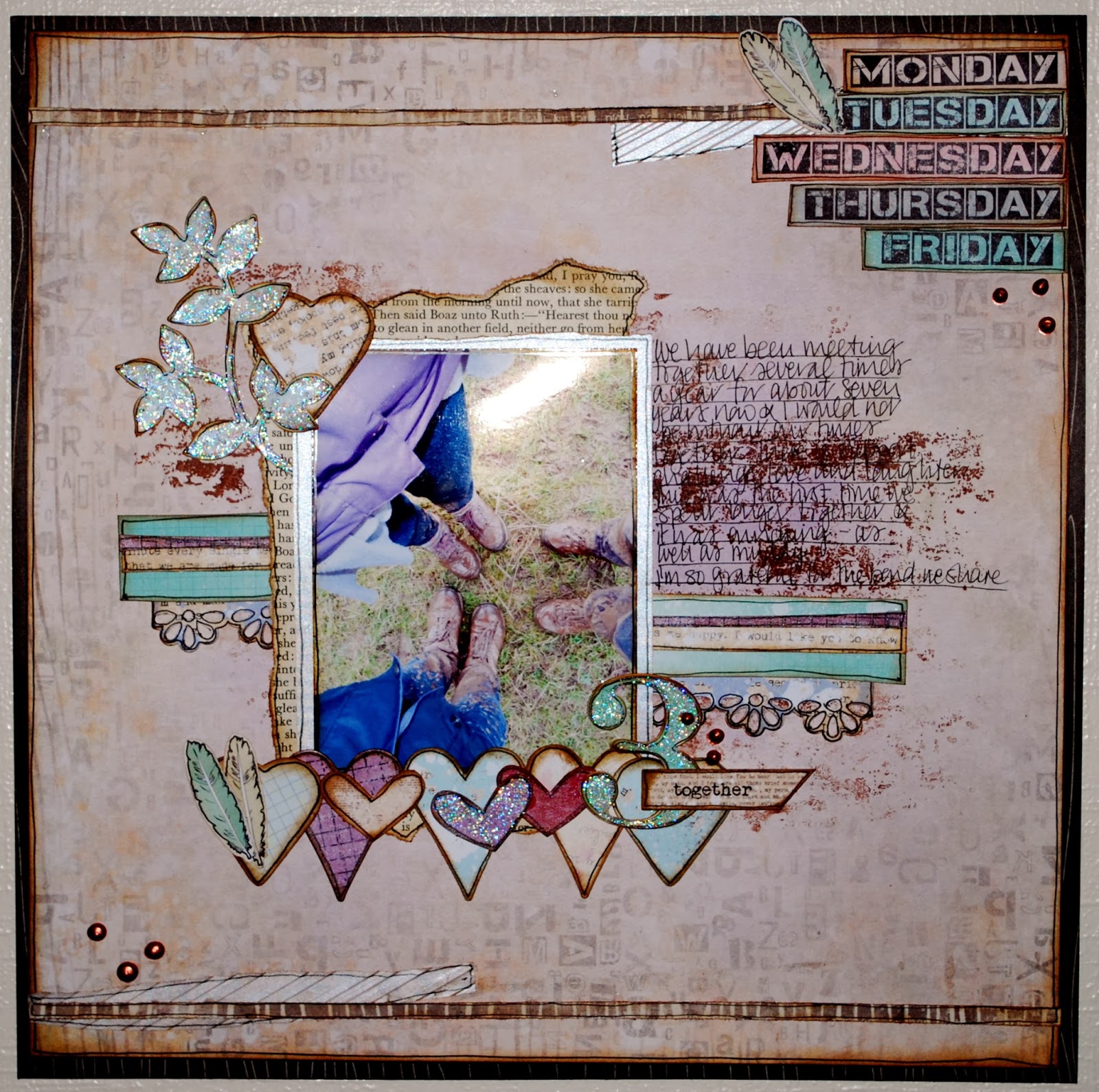
Me and my two friends on a very muddy walk together when we stayed in Derbyshire for a week's study leave.

I decided to add some mud to the layout with some brown ink and a Kaisercraft splatter backgound stamp. The background paper (All are from the 7 Dots Studio Messy Head collection) was already lovely and distressed but I added more with the stamps and Distress ink and some purple mist. I misted some of the paper as well to add to the purple focus. When I bought my coat I didn't think about how much it would appear in my photos and how difficult purple is to scrap with....
The little hearts are die cuts with the Messy Head collection pack and the large ones were cut with Clearly Besotted heart dies. The leaf die is CB as well

I added some paper from a book - it recounts the tale of Ruth but I haven't actually cut up a Bible. The photo also has a layer of vellum behind it. More vellum was embossed and added to the top and bottom of the paper, along with a strip cut from the main paper when I reduced it in size. The very back paper is from Crate Paper. The finishing touches were some feathers (possibly added to cover a glue fiasco), some Stickles for extra glitter, another die cut and some Tulip Beads in a Bottle copper dots.
Here is the writing - slightly more easy to see although it is deliberately hard work for anyone but me!

Next is last months Scrapfriends sketch

And my version which tells a rather special story of the day Carys nearly burned the house down.
Well the shed anyway.
The weather is so bad that I had to take this with flash photography. It does mean that Miss C is not very clear in the photo - here is the original
I am trying to do more mixed media backgrounds. This one uses a lot of Crate Paper On Trend. There are 3 colours of gelato, yellow Heidi Swapp colour shine spray, a Kaisercraft triangles background stamp and some hand drawn pretend free machine embroidery (!) I added a few strips of washi tape and some very old Pink Paislee die cuts. The letter stickers were originally brown but I coloured them with black Sharpie pen and I have just noticed that the dot on the i is missing.
Here are a couple of close ups

T
And finally for today - another mixed media background but no sketch to follow. If I didn't use sketches most of my layouts would look remarkably similar to this
The background to this page started off as a flat cream Bazzill cardstock. I added the stamping (yes, a Kaisercraft background stamp. I buy them from Merly Impressions. They are really good value (£3.25). I usually use them without sticking the stamp to a block as I like the uneven pattern it produces. I then added a number stencil in yellow Distress Ink. I chose Fancy Pants Down by the Shore papers mixed with Dear Lizzy die cut accents. The doily is sprayed with yellow ColourShine, although it looks gold in the flash photography light. I did some doodling and made my journalling deliberately hard to read. (Mind you at that age my handwriting was TERRIBLE). I dabbed some dots of Chalk Spray but they didn't really work.

And I looked and looked at the layout and it just wasn't right. So on impulse I grabbed the yellow distress ink, a brush and some water and painted over most of the background (which is why you can't see the number stencil any more!) I also painted a few blue shadows and stamped with a Dear Lizzy roller stamp. MUCH better than it was. The faded green dots were replaced by more Tulip beads.

That'll do for today :)

Saturday, February 01, 2014

Belt and braces

When it is my turn to chose a challenge for the Daring Cardmakers, I am often stumped. I've been doing this so long that I find it tricky to be original or really challenge myself. So one of the things that I do is to see if there is anything about this day in history that piques my interest. So when I found out that yesterday was 31 years after seatbelts became compulsory in the UK... well firstly I marvelled how short a time it was (I was already a teenager!) and how it is something that seems so important surely it was always mandatory? Although, I also remember the adverts asking us to Clunk Click every trip which also featured some horrific mock accidents.

And secondly, perhaps that the idea of belts just might work... or to translate it into crafty terms - to use some sort of belt on your card. So the idea of Belt and Braces as the dare for this week came to be. And here is my card
It is quite bright and cheerful for a cold February day (actually I made it last Monday but it was cold then too!)
I used three different 6x6 pads for this one - from Lily Bee; MME and Crate Paper. The Crate Paper line had a paper with small cup cakes on it and so I used that as a rough guide for making a larger one for my card. I was pleased to find that the pom pom ribbon was the exact shade to match (think it is May Arts). The red ribbon is from PTI and goes all around the white portion of the card as a belt. It did originally have a bow but that was just too big and then I tried to cut notches out of the ribbon to give it a fancy edge and that went wrong and it was getting shorter and shorter and I don't have that much of the ribbon and can't afford PTI prices to the UK now so ended up cutting it on the diagonal and attaching it with tiny staples. (Yes, I may have been muttering rude words under my breath!) My favourite Paper Smooches greeting and some stick on green and glue on red gems finished the card off.

This week I have also made a couple of layouts, including this one for Scrap365, based on their latest sketch
I used some Lily Bee, AC Dear Lizzy and Fancy Pants papers and stickers along with two Dear Lizzy die cuts. I wanted to keep the layout quite simple on order to let the beauty of the flowers sing. The base is Fancy Pants corrugated cardstock. Some very old letter stickers (7 years or more?) and a few gems and that is that. Still took forever to decide where to put everything though :)