Sunday, February 17, 2013

Just nipping in

as I have loads to do and little time to do it.
And for the next few weeks it will get more so.
Lent is a really important part of church life but it puts extra demands on and leads up to the biggie - Easter! I will have some down time but will talk about that after it has happened...

So this is just a quick marker to let you know I am still alive and still trying to create.
My Lenten discipline involves a wee hint of crafting, but very simple so the creating doesn't become more important than the devotion. Will photograph it at some point

Zuzana chose an awesome dare - putting butterflies on your card. I love putting butterflies on cards so that was no trouble. I had two sympathy cards to make and kind of like the symbolism of butterflies so wanted to do something clean and simple. Which I thought would be quick.
Oh ha,ha,ha
ha,ha,ha
ha,ha,
ha
No

Not helped by (and I am really not complaining about this) the sunshine that made the cards difficult to photograph.
I went for a smooth white card base. I cut a sunburst die from more white card, cut that out with another circle and cut out the centre. I also then die cut the centre of the card base (with me?) die cut and dry embossed some vellum which I stuck across the hole in the card with a glue pen; die cut two butterflies, one from vellum (also dry embossed) and one from patterned paper (Basic Grey PB and J). The butterflies were attached together with a little tape and some thread wrapped round several times. This was covered with silver stick on gems. A scroll was die cut from a Studio Calico 6x6 pad. Butterfly and scroll were stuck to the sunburst circle which was layered over the vellum with small foam pads. I added a Marian Emberson sentiment. Yes it would have been easier to stamp it before I added everything else but why change the habit of a life time?

Having said all that, I do like the way that the card came together. Or cards, as I made two at once. Here is a view that shows off the dimension and the vellum a little better.
I have just made another card which features butterflies but as it is already a day late I have put it in an envelope without photographing it. It is quite nice - you will just have to trust me on that!
And that is all there is for now!

Friday, February 08, 2013

Slightly Squishy

is probably a good description of me at the moment.
All the good work I have done over the past few years in terms of keeping fit has sadly become undone since we moved and in some of my trousers I feel like I am like a little sausage ready to burst out of its skin. Thanks to the way I dress you probably can't tell that much but I can feel it. I'm being honest just to try and shame myself into doing something about it. So far its not working. As Jesus noted about his friends when he asked them to stay awake and pray "the spirit is willing but the flesh is weak" or in my case "would rather eat Reese's Peanut Butter Cups and play on the computer rather than running or doing the Shred". I have bought a Zumba DVD but it hasn't done much good yet. perhaps because it hasn't come out of the box.

I need to gain some discipline. I'm still trying to work out what to do about Lent. For these 40 days i try to take things on as well as give things up. I have bought a lent devotional book which I hope to combine with some light crafting. I will do the Christian Aid Count Your Blessings and I might have to give up sweets and chocolate. (Noooooooooooooooooooooooooooooo. Its only worth giving things up for Lent if it really hurts. I think this year it will)

Anyway onto something much more slimming (more for the wallet than anything else) Cardmaking.
This week on Daring Cardmakers the theme is Love is in the Air (song now going round my head) and here is my rather bright interpretation of the theme

It wasn't really meant to be like this. I knew I wanted to do a button filled heart. I've seen one recently and fell in love but of course didn't keep a link so please let me know in the comments so I can credit properly.
The papers are old Echo Park. I do love a bit of pink and orange together. I drew a heart on white cardstock and coloured it with pink distress ink. Then I had fun choosing buttons to match the colours on the patterned papers. I glued them on lightly and then sewed them to the heart with white thread. I then decided to add some liquid pearls which had mixed success!


The sentiment letters are Dienamics dies. I stuck three layers together, the top one being embossed with Swiss Dots and outlined like everything else with a Sharpie pen.
I've only made one other card this week. I actually remembered my rule of trying to make a card using off cuts from a scrap page. I've almost finished this paper - but still not quite. This October Afternoon paper is quite similar in some ways to the Echo Park used on the other one. Its a bit older though I think
Yuppers - I know what I like in cards and that is a variation on  the same theme! Dies, embossing folders, Sharpie pen, base layer just a little smaller than the card base. Check. Only difference here are some handcut flowers and leaves. And the fact that the Liquid Pearls (check) was used to create a few large blobs not a lot of little ones.

And that is all she crafted! I've got a sermon to write, a wedding couple to talk to and a house to clean tomorrow so I'm not sure much crafting will be done. Its no good me hoping. I know that saying to a congregation "I didn't finish the sermon, but look at this lovely get well card" won't go down particularly well.... Have a lovely weekend whatever you are up to.

Tuesday, February 05, 2013

Telling Tales

I've joined a really fab scrapbooking class called Telling Tales. Miss Smith has put together some great pages and prompts AND it is pretty cheap AND it is part of her fundraising for Girlguiding UK which makes you feel good into the bargain. (Not too late to join up)

As ever with such classes I dream of having oodles of time to keep up to date. That is so not my life. But I have now managed two layouts which kind of fit the prompts. I'm not telling you what they are as that would be like, telling tales and you will just have to sign up if you want to know.

BTW what is it with the whole telling tales thing. I think not giving away paid for information is one thing but why do we say to children that it is wrong? So often we need to know what is happening and it is not tale telling. It leads to secrets and lies and all sorts? And why do we still seem to punish whistleblowers rather than praise them?
I don't have any answers, just a bit of idle wondering there....

Here is layout 1:

I was looking through some old photos and found these from a VERY long time ago. NB they are slides that my dad converted and then "edited" which is why my right eye looks funny in the second photo. The tale of these photos is a favourite one in my family. How we were fighting until we saw the camera and stopped and smiled like we were best friends. Anna came over again a few times. Although we were the same age we never really clicked. I think probably someone didn't like sharing their parents (that would be me then)

I used some old October Afternoon paper and the lined paper background is Basic Grey. I also used a Heidi Swapp journalling card coloured with Distress Inks, one of my Dienamics camera dies, a Spellbinders embossing folder, Making Memories/Adornit/American Crafts letter stickers. And some spray inks.
Oooh and some Prima plastic flower thingies. And a cute flag that I found in my stash.
The NCH home is where my brother came from. They had an open day every year. I always found it very exciting. I'm not sure he did though. (But then he can't remember it and I can and THAT is another story)

This one mostly uses Echo Park Times and Seasons with another BG Basics background. I think I have cracked layering papers. What I still want to be able to do is add lots of little details tucked in - like Lilith Eckels does (sigh). She is fab. And not just because her name is a bit like mine...
The only non Times and Seasons things are some Card Candy dots, some spray, Black Distress Ink, some stick on gems and some Liquid Pearls. Oh and the bit of paper with the writing on is from a BG journalling pad.

I don't know what I am doing in the middle picture of the three. It looks suspiciously like incy wincy spider....


Sunday, February 03, 2013

Are you sitting comfortably?

because it is Story Telling Sunday.
I knew just what precious thing to pick this time.
It may not look that precious to you though
Its a radio alarm clock.
Which was given to me on my 18th birthday on behalf of my most beloved grandfather - known as Pop. It was on his behalf because he had died just over 5 years previously on 28th May 1978, the day after my mother turned 40. I think Mum and Dad chose to give a gift from him because they knew of the close bond that we had and wanted something to mark it. It was lovely to have something to remember him by (although my next "precious" might be something else I have of his too!). There are a few significant things with regards to this radio alarm.

1) Pop and I really loved each other. He was my only grandfather - my dad's parents had both died before I was born. Until I was two we lived in the same road and he did a lot of caring for me. Gramma, his wife was lovely too but more distant in my life - not just because she died when I was 8. Pop chose his grandad name because he wanted it to be something that a baby could say easily and even be the first word. Being a teacher he worked hard to train me and according to mum it worked. I think he was a much better grandfather than father
My first memory is of being pushed in a pushchair along the Baglan Road and pointing up at the street lights and saying something about them. In Welsh. I lost my Welsh when we moved to England so it must be before I was two (I did start talking early much to everyone's chagrin delight and my Welsh was on a level with my mother's at the time. Apparently)

Most photos of me and Pop are at my parents house. And there are lots of memories that were not photographed as I used to spend precious holidays with him on my own, or with my brother. But the few I have, he is always looking like this at me. I hope he still does

2) The radio still works! I will be 48 next birthday. It is still going strong after almost 30 years. True, the cassette player stopped working but hey, who uses cassettes these days. But I do remember using the radio/cassette combo to create my own playlists

3) A few years ago, off their own bat the children decided to buy Phil a new clock radio as a Father's Day present. I tried to hide my feelings but I suspect my face was a little like Mrs Doyle at getting an instant teamaker
(Best. Father. Ted. Ever)
For a while "my" clock radio was removed. But to be honest, I pined. I felt like my arm had been cut off. It is only a thing. It is only a thing that wasn't even really given to me by the person whose love it somehow encapsulates for me. (And I am always cross with it when it goes off in the morning as I would rather stay asleep) But my lovely husband understood and although it was hard for him not to use his specially chosen and paid for the very first time by his children present, it is mine that we use. I don't know how I will feel when it finally stops working.
(with Pop as bridesmaid to my Uncle David and Auntie Clare)


4) By chance - at least in my eyes, our wedding date was 10 years to the day after Pop died (yes, the day after mum's next milestone birthday) and it has created another memory in which he is still very much part of life, even though it is almost 35 years since he died. How strange though that something as mundane as a clock radio could sustain this bond of love

Bet you never expected all that when you first saw the picture (and yes I might have cried a teeny bit whilst writing all this down!)


Friday, February 01, 2013

Life imitating art

The very lovely and highly talented Kathy who is one of the founder members of Daring Cardmakers also acts as unofficial prodder in many ways. One is making us talk to each other regularly. (We do love each other loads we are just all super busy) Anyway, she poses a daily question during the week. Today's was "what are you wearing". As I described my outfit - mostly black with a red/light grey/dark grey/white/black top - I realised that I am basically wearing this months Daring colour combination
This is the combo that Kathy found for us
This is not my dress but it is remarkably similar - by the same company (Purple) that sell through Dorothy Perkins. I love their dress/tops
If I could find that dress I would buy it too. They always have interesting details on them.
I still feel a bit silly :)
Thatnotwithstanding (one of the best words ever)
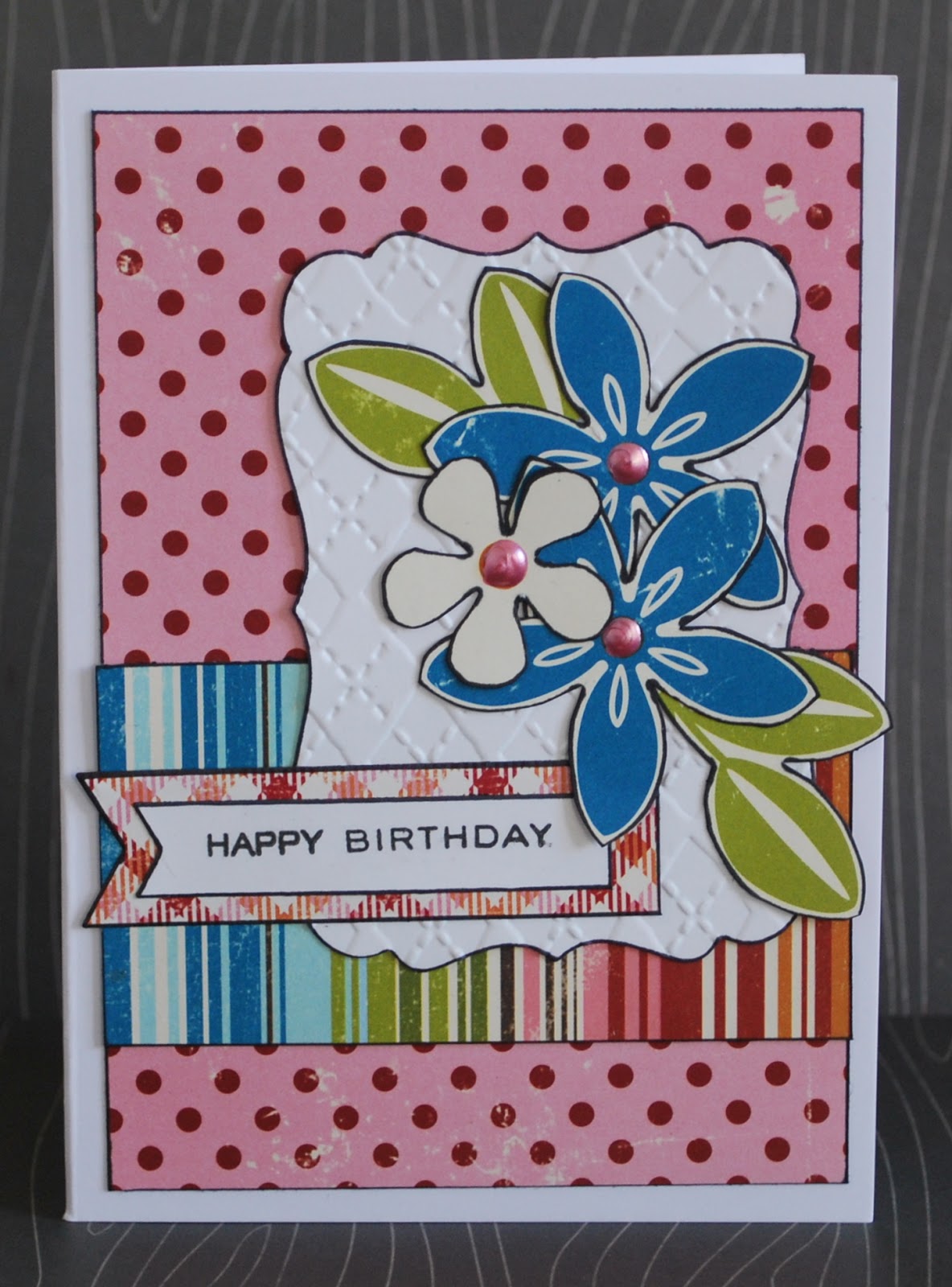
here is my card

which didn't quite go as planned. I think that my decision to be brave and not line everything with black pen meant that I don't like it because there is no black outlining...
I used an A4 cardstock cut in half and folded so it opens the tall way. I found some Echo Park papers and also some Kaisercraft ones in the right colours. oh and the heart i the middle is cut from Basic Grey. Hey 3 companies on one tiny card - not bad. I also used a QK heart die and a new Memory Box Chesapeake circle die which I cut from two sheets of heavyweight cardstock at one time and gently eased out most of the top layer to let the lighter grey show through. The white panel uses one of my favourite Cuttlebug embossing folders. The stamp is Marian Emberson, cut using a Dienamics Fishtail die. I then mounted the white panel on foam pads and the grey panel on more pads. I thought as I would give this to Phil for Valentines this would be ok. I have however forgotten to hide it so it is all slightly less romantic...
Much less romantic than the flowers and card I got for St Dynwen's Day (the Welsh equivalent of St Val. I didn't even know when it was)
I also used Liquid Pearls, Stickles AND enamel accents. Overkill?

Here is another card made recently using a new Memory Box die - the small sunburst. Oh so cute! The papers are all MME

Spot the other new die...
I have a rather lovely Simon Says Stamp die that cuts a shape into the card. I thought this die would do the same. Imagine my surpirse when that mesh part came away in my hand. Then I remembered the crafters new old best friend - vellum. I used some behind the cut out part to stick it back in again and used some more as one of my sentiment layers, along with some old scraps of paper. Note to self - black outline (or blue as on the card above) makes everything better.

Here is a sideways look at how vellum came to the rescue
It could almost have been deliberate...

I've been writing this blog post as I recover from Messy Church. Actually it was fab tonight. we gave the kids an idea of what to do and they ran with it. It was the rather abstract concept of drawing a road surrounded by things like forest, sunshine, the sea, a cave, mountains. The idea is that during the 40 days of Lent they reflect on each day and write the number next to the picture that most sums up how they felt that day. And most of the kids aged 6 and over really got it. And even the ones younger loved drawing the shapes ("squiggle, squiggle" "thats a cave in the sea" "I'm dwawing a weely big wiver" etc)

I did the double of doing a craft and leading the worship part. Thinking about Lent, in the Messy Church book they likened Jesus stay in the desert to Big Brother. But it hit me that with the tests and everything it is much more like "I'm a celebrity get me out of here" which has my brain doing all sorts of things and really looking forward to preaching on the temptation in the desert already. 
But first this Sunday which combines the reading that everyone knows that isn't the 23rd Psalm - 1 Corinthians 13 (all about what love is), with Jesus telling people that even in the Old Testament it wasn't always the Jews that were God's priority and his hearers decide to throw him off a cliff. (Spoiler - he escapes). So a lot to think about and not much written as yet.
Tonight we watch the last episode of Buffy Series 2 but I am not sure it will be much help!

Wednesday, January 30, 2013

And life goes on

it is the beginning of February the day after tomorrow. We are 1/12 of the way through the year already. Today I was at a meeting which was starting to plan for work from Sept 2013-August 2014. I already have two weddings booked in for 2014. And realise that if I am going to have a sabbatical that year I had better start deciding on dates now. I was looking to see when the flower festival might be as well (important stuff you know) as well as juggling other things like Carys and my birthday celebrations and realising she will be 18 then.
And life goes on.
But still that is aaaaaages away.
Yet only a heartbeat.
I think photos of my three when they were little become even more treasured now as they are not sweet smelling bundles of joy that sit on my lap and give me kisses (ok Carys still does that and they are all still bundles of joy. We'll say no more about whether they are sweet smelling). And actually it won't be THAT  long (she hopes) before the next generation arrives.

OK before I start wailing about how my liiiiife is neaaaaarly ooooooover, how about showing what I have been creating recently?

the layouts are all  based on sketches.
One from Creative Scrappers #245
I used a Studio Calico template and various sprays. I also used a Heidi Swapp mask and some white paint. I also included a few strips of Crate Paper Random; a Hambly transparency; American Crafts thickers and Studio Calico chipboard hearts. Oooh and Lily Bee/Crate Paper stickers. And lots of black pen.

Secondly Sketchbook 365 Challenge - which included multiple photos - eek!
You can see the dimension thanks to the fact the actual sun cast shadows. 
I made the background as muddy as the walk! Including a woodgrain stencil and a Kaisercraft stamp.
All the papers and stickers are from Basic Grey Clippings apart from the little bird and kite cut from a MME 6x6 pad. The letters are Amy Tan "thoughts" and very, very old something "foxed". And buttons from stash threaded with twine.
Phil thinks the blurb is really hard to read so here is it in close up

Here are the fussy cut details which you have to admire as they took ages to do


and finally one based on Creative Scrappers #244

Papers are from all sorts of places. Some are October Afternoon. The background paper is Heidi Swapp coloured with Distress Ink. I added stars cut using a MFT die - and used another for the journalling block. My favourite part is the title - I die cut letters in black funky foam and then smooshed lots of silver Stickles over the top.
And that's all there is right now!

Sunday, January 27, 2013

Evolving

The post title mostly refers to my new tack on crafting - namely art journalling. I so love what proper artists do in little books and following Nat Kalbach's Creative Jumpstart this year has given me a , well creative jumpstart. Actually the free series she did in January 2012 did this too but it took me a whole year to get going! I think the final stimulus was the Julie Fei Fan Balzer technique video using her own stencils (which I have watched more than once). Which also meant buying more stencils. Sigh. I am so weak. Less damaging than some things I could spend money on but still...

So here is page 1
Lots of layers of stencils - mostly using Distress Ink but also a little bit of black acrylic paint added with a make up sponge and doing the "dayb ahn, dayb awf" thing that Julie Balzer says and I can't help repeating in my head as I do it (love her Noo Yawk accent) (i.e. dab some paint onto the sponge and dab it off again before putting it to paper).

The next few pages have evolved. And I started to take photos as they moved and changed. Which is quite cool. So...
This was done at the same time as my two Christmas decorations layouts. When I had sprayed the "reflections" layout using a mask, I then pressed the wet mask into the paper here. Then I swooshed it a bit with a baby wipe. Then a layer of glitter paste. Which was coloured with distress ink. Then some red stamped scrolls. Then some black stamped ink splots all around. (OK I could have photographed it in between some of these layers)

The next stage was photographed using a flash so you can see the glitter. And spot what else was added

And finally - the finished product
Not bad but I wish I had used a thinner pen for journalling with.
Here is the third page which first had a coat of gesso painted on

Then I used a zebra stencil with some chalk sprays. The stencil doesn't fit across the whole page. I outlined the stripes with black pen.
I made my own stencil letters by cutting out my dienamics letters and inking over the spaces. Added some Stickles dots and writing but for a long time it just wasn't done. Kept tinkering about
 Much prefer it now. Louder lines with a sharpie pen. White paint circles and a little washi tape. Stickles all over.

And finally...
one of the Creative Jumpstart videos was about just letting paint be swooshed and dripped and splattered and then see what you can see. In the vid the resultant flower shapes were left there and the rest of the colour was gessoed out but I did something different.
Here is my finished painted bit.
I looked and first all I could see was a mess
And then I saw a tree just left of centre. So I outlined that and then added a stamped title and a quote from Dietrich Bonhoeffer about waiting and seeds. And I loved it
After adding the writing I saw more trees and bushes so outlined them too
My favourite page so far.
Except that I then decided that the title needed some white. And I went for enamel dots. Which has turned out to be a bit of a mistake. So this page still needs some evolving.
And I do too.
The pattern of life that I have developed here needs to evolve and change - one of the things I have realised is that there is an awful lot of time taken up with meeting with other people in various ways. Which is fabulous! But I am an introvert and do need times on my own to recharge my batteries. I am hoping to evolve my art journal to be a place of spiritual reflection and creative prayer - my last page points the way towards that and I need to find a way to make space to do it.

Friday, January 25, 2013

Cue for my favourite joke

Why are pirates called pirates.
Because they Aaaaargh.

Which has been swirling round my mind as I made my Daring Card for this week. (I wish I could have remembered it when Carys asked me for a joke two days ago. When put on the spot I can only remember a rude joke told to me 25 years ago. I'm not repeating it now. But whenever asked for a joke that one comes to mind first and allows no cleaner ones entry and I always have to say "I don't know" rather lamely)
Anyhoo this week we were all sent die sets from the generous Docrafts to play with. And if you join in this week you can win one of them too!
I was sent the Nautical set. The die sets look huge and I did wonder how it would all fit on a card. Well
a) you don't use all the dies at once
b) they are deceptive. I used a 5x5 cardbase which is not that big and managed to fit a load on anyway.

If there seems to be an extra wet look to the Stickles that is because when I first finished the card there weren't any. And the whale didn't have a spout. It was just wrong. So a quick spurt of stickles later and I snapped the card while there was still enough light. The sun is a Memory Box die and clouds are Dienamics. Everything was sponged with Distress Inks of various colours which does help to give dimension. I don't have alphabet stamps small enough to stamp a custom message but don't really like my handwriting on cards. Ah well.

I've also done a layout this week. It is based on one of Shimelle's most excellent  scrapbook starting points - a sketch for two 4x6 photos. My photos are not 4x6 but that is the beauty of scrapbooking - it is adaptable.
I used the lovely Random papers by Crate Paper with a few other things thrown in - like a grey spotted OA journalling card and a paper compass from a different CP set. But see - there is some purple paper (the thin strip). For some reason it is really hard to find purple scrapping paper. Wish I had thought of that when I bought my coat (not a fashion purchase but a windproof, waterproof coat that is necessary in Devon and it was this colour or nothing. Phil has bought a similar coat more recently in a bright red which I much prefer). There is also some washi tape; MME enamel dots and some dewdrops (the clear raised things) that I found on my still fruitless search for the little wooden stars I have put somewhere.

After I had started sticking down the first word of the title (using BG chipboard letters) I realised that I had made a layout within the last 4 months about a family walk that also started with "another". Fortunately they won't be in the same album as I have just finished one. Still a bit annoying though. But then we do have a lot of adventures on family walks (and many photos of the back of my kids!)
Phil photoshopped a photo of the day to demonstrate my mum's poor choice of headgear and how windy it was. I thought it was too mean to put that on a page. But will still show it here!
(My dad is called Ivor and this is what mum says when she is in distress)
Chortle

Tuesday, January 22, 2013

Well...

Cold still hasn't really developed so probably it won't. Phew.

But I'm still bone weary. Fortunately because I am a bear of little brain I tend to forget how pants January is. Until it comes round and hits me in the face again. Still not so much of it left now. Ah, but then its February. Hmmmm I probably shouldn't move to Scandinavia with that attitude.

Although I love their tv shows. Borgen is on now which is like the West Wing but proper European. I am so proud that I can now tell the difference between a Swedish and a Danish accent. Every now and then I think that I can suddenly speak Danish but then realise that they have switched to English. Effortlessly. And the lead in Borgen has a cracking French accent too. Also it is just as well that I have finished having children as I love all their names. I'm trying to convince Carys to call her children Troels, Pernille, Pilou, Sidse and Soren but she remains unimpressed by my choices. (NB I don't really expect her to have that many children. And I got to choose names for my kids so what ever she chooses will be lovely) (BTW I've just googles and it turns out Pilou is a nickname so that one can leave the list)

Anyhoo here are some layouts that I have finished recently
the first one was a bit experimental
and the camera hated it! Couldn't get a good sharp picture. Maybe the camera was trying to tell me something...
I decided to go for a funky background on patterned paper. I'm beginning to think I should give up on trying painty backgrounds as I am never happy! First I put on some Gesso, then when that was dry I added some glitter texture paste and covered some of that with a light blue paint. I added some artemio stamped swirls in red ink. All the papers are from my Christmas card leftovers so include a lot of Basic Grey and some Fancy Pants. The stickers are all Basic Grey. I enjoyed using all those letter stickers all at once. I think that is all the green "e"s though. I also added some Sarahs Cards red gems and some stars that I bought in Wilkinsons - a huge lot of them for 10p as they were in with the Christmas decorations sale.

Here's the writing. When it was done I was disappointed that the red swirl was under the journalling block so I stamped another swirl on the top. Its a little smudgy as the sticker is shiny but you wouldn't know it wasn't all one stamp if I hadn't told you would you?

I'm happier with this layout
I bought a few sheets of 12x12 Midway by October Afternoon as well as the 8x8 pad so used one of those as the background to this page. I now have some ink droppers that were put to good use with the black and red mists. I randomly chopped papers to layer behind my photo. Because the background paper had got a little dog eared at the edges I decided to add in top and bottom layers (header and footer if you will. I write too many papers). The letters are two sorts of Amy Tangerine thickers. The ones under her brand seem to last for ages, I'm not sure why. Other embellishments are a metal star (I've got loads of these hanging around!); some Basic Grey flair (that is the name for the red thing that looks like a badge but isn't) and a Studio Calico heart. The little stars are Studio Calico too. I have a whole packet of them somewhere but it hasn't been put back where it should be (by me) and I have tidied two drawers and still not found them. Otherwise there would have been more on the page. The other little dots are Liquid Pearls (uh-huh I am addicted to them). Oooh and the paper clip and banner are Smash. I have a Smash journal which I think I am going to use for my trip to Florence later in the year to celebrate our Silver Wedding. (Oh boy, admitting I have been married almost that long makes me feel really, really old). At this rate I won't have any actual Smash elements left! oh dear, I'll just have to buy some more then...

I hope you feel full of sunshine inside even if it is dark and cold and horrible outside!

Saturday, January 19, 2013

Out of kilter

because

1: We are about the only part of the UK with no snow. I like a good 36 hours of proper snow. And then for it to disappear instantly

2: I went to see Les Mis this week and came out unmoved. I looked at my watch near the end to see how much more I had to endure. My poor DCM colleagues and Facebook friends have heard some of my reasoning so I won't go into it now, but it is odd to read about rave reviews and people sobbing and thinking "how come we watched the same film?" And I quite liked Russell Crowe as Javert

3: I am bone weary, keep feeling like a horrible cold will develop and yet it isn't. I DON'T want a cold, but I want to stop feeling on the edge of one. I am not much fun to be around!

4: I've actually managed a bit of crafting this week but the bad light has meant that taking photos and then finding time to blog has been limited. I could have done a lot more crafting as I didn't have as many evening meetings this week but thanks to 3: I spent more time lying on the sofa watching Buffy (now on series 2 and Spike has arrived. Yay!)

You should have seen the shenanigans to get anywhere near a decent card for DCM this week. Keilly dared us to go for Embossability
Here's my card
I bought a bargain priced Docrafts deep embossing folder this week (OK I bought 2). I love the dimension it gives to plain cardstock. I tried inking and embossing at the same time as well but that didn't work, so I embossed one of the clock faces again and swooshed ink over it. What I should have done is carefully measured everything as I planned to put it over the matching plain white image - but my embossed greeting section was too big. (Yes "Celebrate" is slightly squiffy). I used October Afternoon Midway papers; Banana Frog and Imagine That stamps; Versamark ink and detail white embossing powder; Liquid Pearls and  enamel accents.
I decided to go one stage further with the old embossing and do some triple embossing with UTEE. I took a chipboard number and green and blue UTEE, embossing and melting 3 times. on the last layer I pressed a Clearly Besotted stamp into the still warm powder to create this ridge effect. Only now have I remembered that perhaps clear stamps aren't the best thing to use for this so hopefully my lovely new stamp is still ok. I'll report back!


I also made a card for a church member who reached a special age this year. Again the light was TERRIBLE so please excuse it
The numerals are a pale pink in real life and have been embossed and covered in glitter, as were the paper roses and leaf. It is lovely to know that you are hand delivering a card so it can have loads of dimension. The papers are all Echo Park This and That Graceful. I also used PTI number dies; Sizzix and Dienamics shape dies; Cuttlebug embossing folder; Martha Stewart punch; Imagine That stamp.

One other thing to share just now - as I wasn't feeling creative I decided to be useful instead and made handy guides for my Stickles and Liquid Pearls so that I know what colours I have and what they look like

Turns out I have quite a few.... I love using Liquid Pearls most as they tend to flow much better which allows for more even distribution. I had trouble with the green and patina Stickles as you might be able to tell. Hopefully this will help me to use them even more.


If you have snow this weekend - hope you are safe and warm and can have some fun!